• For Individuals
  • For Businesses
  • For Universities
  • For Governments
Coursera
  • Log In
  • Join for Free
    Coursera
    • Browse
    • Histogram
    Skip to search results

    Filter by

    Subject
    Required
     *

    Language
    Required
     *

    The language used throughout the course, in both instruction and assessments.

    Learning Product
    Required
     *

    Level
    Required
     *

    Duration
    Required
     *

    Skills
    Required
     *

    Subtitles
    Required
     *

    Educator
    Required
     *

    Results for "histogram"

    • Status: New
      New
      M

      Macquarie University

      Statistics and Data Analysis with Excel: Essentials

      Skills you'll gain: Microsoft Excel, Excel Formulas, Statistics, Statistical Hypothesis Testing, Descriptive Statistics, Data Analysis, Statistical Inference, Data Visualization, Box Plots, Histogram, Statistical Methods, Data Visualization Software, Variance Analysis, Probability Distribution

      4.8
      Rating, 4.8 out of 5 stars
      ·
      6 reviews

      Beginner · Course · 1 - 3 Months

    • Status: Preview
      Preview
      U

      University of Toronto

      Data Visualization for Genome Biology

      Skills you'll gain: Data Visualization Software, Statistical Visualization, Interactive Data Visualization, Bioinformatics, Ggplot2, Dimensionality Reduction, Scatter Plots, R Programming, Network Analysis, Heat Maps, Molecular Biology, Design Thinking

      4.8
      Rating, 4.8 out of 5 stars
      ·
      24 reviews

      Intermediate · Course · 1 - 3 Months

    • C

      Coursera Project Network

      Detecting COVID-19 with Chest X-Ray using PyTorch

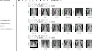
      Skills you'll gain: PyTorch (Machine Learning Library), Image Analysis, Deep Learning, Artificial Neural Networks, Machine Learning Methods, Medical Imaging, Computer Vision, Machine Learning, X-Ray Computed Tomography

      4.5
      Rating, 4.5 out of 5 stars
      ·
      339 reviews

      Intermediate · Guided Project · Less Than 2 Hours

    • Status: Free Trial
      Free Trial
      J

      Johns Hopkins University

      Building Data Visualization Tools

      Skills you'll gain: Ggplot2, Data Visualization Software, Data Visualization, Datamaps, Visualization (Computer Graphics), Interactive Data Visualization, Scatter Plots, Histogram, Graphic and Visual Design, R Programming, Geographic Information Systems, Software Development

      3.9
      Rating, 3.9 out of 5 stars
      ·
      158 reviews

      Intermediate · Course · 1 - 3 Months

    • Status: Free Trial
      Free Trial
      U

      University of London

      Statistics for International Business

      Skills you'll gain: Sampling (Statistics), Descriptive Statistics, Data Presentation, Statistics, Estimation, Probability, Data-Driven Decision-Making, Probability & Statistics, Statistical Inference, Statistical Hypothesis Testing, Probability Distribution, Data Visualization, Data Analysis, Histogram, Graphing

      3.8
      Rating, 3.8 out of 5 stars
      ·
      310 reviews

      Mixed · Course · 1 - 4 Weeks

    • C

      Coursera Project Network

      Python for Data Visualization: Matplotlib & Seaborn

      Skills you'll gain: Matplotlib, Histogram, Plot (Graphics), Data Visualization, Seaborn, Scatter Plots, Data Visualization Software, Statistical Visualization, Graphing, Python Programming

      4.6
      Rating, 4.6 out of 5 stars
      ·
      67 reviews

      Beginner · Guided Project · Less Than 2 Hours

    • Status: Free Trial
      Free Trial
      E

      Edureka

      Python for Data Visualization and Analysis

      Skills you'll gain: Data Visualization, Exploratory Data Analysis, Matplotlib, Data Visualization Software, Seaborn, Statistical Visualization, Interactive Data Visualization, Plotly, Dashboard, Scatter Plots, Data Analysis, Pandas (Python Package), Histogram, Box Plots, Jupyter, NumPy, Web Applications

      Intermediate · Course · 1 - 4 Weeks

    • Status: Free Trial
      Free Trial
      J

      Johns Hopkins University

      Data Visualization in R with ggplot2

      Skills you'll gain: Ggplot2, Scatter Plots, Plot (Graphics), Data Visualization, Data Visualization Software, Heat Maps, R Programming, Graphical Tools, Data Wrangling, Tidyverse (R Package), Graphics Software

      4.9
      Rating, 4.9 out of 5 stars
      ·
      129 reviews

      Intermediate · Course · 1 - 4 Weeks

    • C

      Coursera Project Network

      Plots Creation using Matplotlib Python

      Skills you'll gain: Matplotlib, Box Plots, Plot (Graphics), Seaborn, Data Visualization, Data Visualization Software, Pandas (Python Package), Scatter Plots, Data Presentation, Data Import/Export, Histogram, Python Programming, Data Manipulation, Data Analysis, Data Structures

      3.9
      Rating, 3.9 out of 5 stars
      ·
      9 reviews

      Beginner · Guided Project · Less Than 2 Hours

    • Status: Free Trial
      Free Trial
      J

      Johns Hopkins University

      Foundations of Data Visualization

      Skills you'll gain: Data Presentation, Graphic and Visual Design, Data Storytelling, Design Elements And Principles, Plot (Graphics), Data Literacy, Exploratory Data Analysis, Scatter Plots

      Intermediate · Course · 1 - 3 Months

    • C

      Coursera Project Network

      Create a Simple Gantt Chart using Microsoft Excel

      Skills you'll gain: Timelines, Project Schedules, Microsoft Excel, Data Visualization, Dashboard, Scheduling, Project Management Software

      4.5
      Rating, 4.5 out of 5 stars
      ·
      116 reviews

      Beginner · Guided Project · Less Than 2 Hours

    • C

      Coursera Project Network

      Python for Data Visualization:Matplotlib & Seaborn(Enhanced)

      Skills you'll gain: Matplotlib, Seaborn, Plot (Graphics), Scatter Plots, Histogram, Data Visualization, Data Visualization Software, Statistical Visualization, Data Analysis, Python Programming

      4.6
      Rating, 4.6 out of 5 stars
      ·
      26 reviews

      Beginner · Guided Project · Less Than 2 Hours

    1…678…13

    In summary, here are 10 of our most popular histogram courses

    • Statistics and Data Analysis with Excel: Essentials: Macquarie University
    • Data Visualization for Genome Biology: University of Toronto
    • Detecting COVID-19 with Chest X-Ray using PyTorch: Coursera Project Network
    • Building Data Visualization Tools: Johns Hopkins University
    • Statistics for International Business: University of London
    • Python for Data Visualization: Matplotlib & Seaborn: Coursera Project Network
    • Python for Data Visualization and Analysis: Edureka
    • Data Visualization in R with ggplot2: Johns Hopkins University
    • Plots Creation using Matplotlib Python: Coursera Project Network
    • Foundations of Data Visualization: Johns Hopkins University

    Other topics to explore

    Arts and Humanities
    338 courses
    Business
    1095 courses
    Computer Science
    668 courses
    Data Science
    425 courses
    Information Technology
    145 courses
    Health
    471 courses
    Math and Logic
    70 courses
    Personal Development
    137 courses
    Physical Science and Engineering
    413 courses
    Social Sciences
    401 courses
    Language Learning
    150 courses

    Coursera Footer

    Technical Skills

    • ChatGPT
    • Coding
    • Computer Science
    • Cybersecurity
    • DevOps
    • Ethical Hacking
    • Generative AI
    • Java Programming
    • Python
    • Web Development

    Analytical Skills

    • Artificial Intelligence
    • Big Data
    • Business Analysis
    • Data Analytics
    • Data Science
    • Financial Modeling
    • Machine Learning
    • Microsoft Excel
    • Microsoft Power BI
    • SQL

    Business Skills

    • Accounting
    • Digital Marketing
    • E-commerce
    • Finance
    • Google
    • Graphic Design
    • IBM
    • Marketing
    • Project Management
    • Social Media Marketing

    Career Resources

    • Essential IT Certifications
    • High-Income Skills to Learn
    • How to Get a PMP Certification
    • How to Learn Artificial Intelligence
    • Popular Cybersecurity Certifications
    • Popular Data Analytics Certifications
    • What Does a Data Analyst Do?
    • Career Development Resources
    • Career Aptitude Test
    • Share your Coursera Learning Story

    Coursera

    • About
    • What We Offer
    • Leadership
    • Careers
    • Catalog
    • Coursera Plus
    • Professional Certificates
    • MasterTrack® Certificates
    • Degrees
    • For Enterprise
    • For Government
    • For Campus
    • Become a Partner
    • Social Impact
    • Free Courses
    • ECTS Credit Recommendations

    Community

    • Learners
    • Partners
    • Beta Testers
    • Blog
    • The Coursera Podcast
    • Tech Blog

    More

    • Press
    • Investors
    • Terms
    • Privacy
    • Help
    • Accessibility
    • Contact
    • Articles
    • Directory
    • Affiliates
    • Modern Slavery Statement
    • Manage Cookie Preferences
    Learn Anywhere
    Download on the App Store
    Get it on Google Play
    Logo of Certified B Corporation
    © 2025 Coursera Inc. All rights reserved.
    • Coursera Facebook
    • Coursera Linkedin
    • Coursera Twitter
    • Coursera YouTube
    • Coursera Instagram
    • Coursera TikTok